Exploring Collusion#
Members of the FTSO Management Group are responsible for monitoring the FTSO ecosystem for malicious behaviors, such as collusion. Collusion in the FTSO ecosystem is a problem for several reasons:
- It artificially raises the power of the colluding data providers, which endangers the quality of the FTSO data.
- It is specifically forbidden by FIP.02.
In a healthy ecosystem, submissions from data providers are chasing the median, and they are close to the reward band. Collusion is possibly evident in this environment when multiple data providers submit similar data that is relatively distant from the median. To explore possible collusion between data providers in the ecosystem, use the collusion tool in the Flare FTSO Monitor.
Collusion Tool Dashboard#
The following image shows the dashboard of the collusion tool:
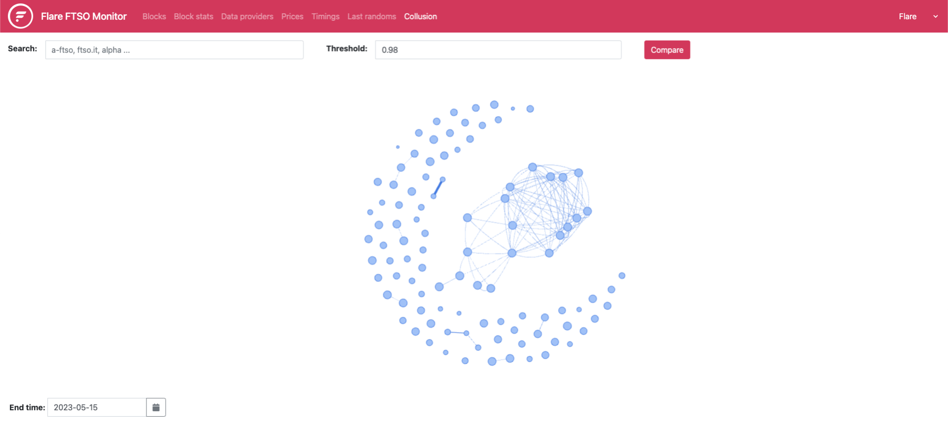
The elements of the collusion tool are:
- Threshold: Scans for the percentage of similarity that you want to see between the data providers for which you search. Details about how to specify the percentage are in step 2 of the procedure to identify data providers.
- Search: Locates data providers within the FTSO ecosystem. Details about how to specify names of data providers are in step 3 of the procedure to identify data providers.
- End time: Sets the date you want to view.
- Cluster map of data providers: Illustrates data providers that might be colluding by linking them with weighted connectors. The map is generated based on the data submitted during 00:00 - 24:00 UTC on the date you select in the End time field. Heavier weights suggest more potential for collusion than lighter weights.
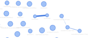
For example, the following image of part of the cluster map shows a pair of data providers weighted heavily enough to suggest a case of collusion.
Identifying Colluding Data Providers#
For exploratory purposes only
Use this tool only for exploratory purposes. Do not exclusively rely on this tool to infer that collusion has occurred.
- Open the collusion tool in the FTSO Monitor. The collusion tool dashboard is displayed.
- In the Threshold field, specify the percentage of similarity you want to see.
For example, if you specify
.98, 98% of the weakest similarities are omitted, and the strongest 2% of the similarities are displayed. -
Use one of the following search methods:
- If you know the names of the data providers you want to compare, specify them in a comma-separated series in the Search field. The field is case-sensitive and accepts partial names of providers. For example, if you specify
FTSO, the tool selects all providers that have FTSO in their names, regardless of case. - In the cluster map, locate data provider nodes linked with heavily weighted connectors by zooming in. Zoom in and out by using the appropriate method on your device, such as spinning a mouse wheel. After you zoom in, you can center a node or a group of them on the screen by clicking the map and dragging it. Select at least two providers you want to compare by pressing and holding the Control key while you click each data provider node.
- If you know the names of the data providers you want to compare, specify them in a comma-separated series in the Search field. The field is case-sensitive and accepts partial names of providers. For example, if you specify
-
Optional: Explore a previous date by changing the End time option to a date other than the current date.
- Click Compare. As shown in the following image, the Prices tab opens, displaying a line graph that shows the data submitted by each specified data provider during the most recent 30-minute interval on the date you selected in the End time field.
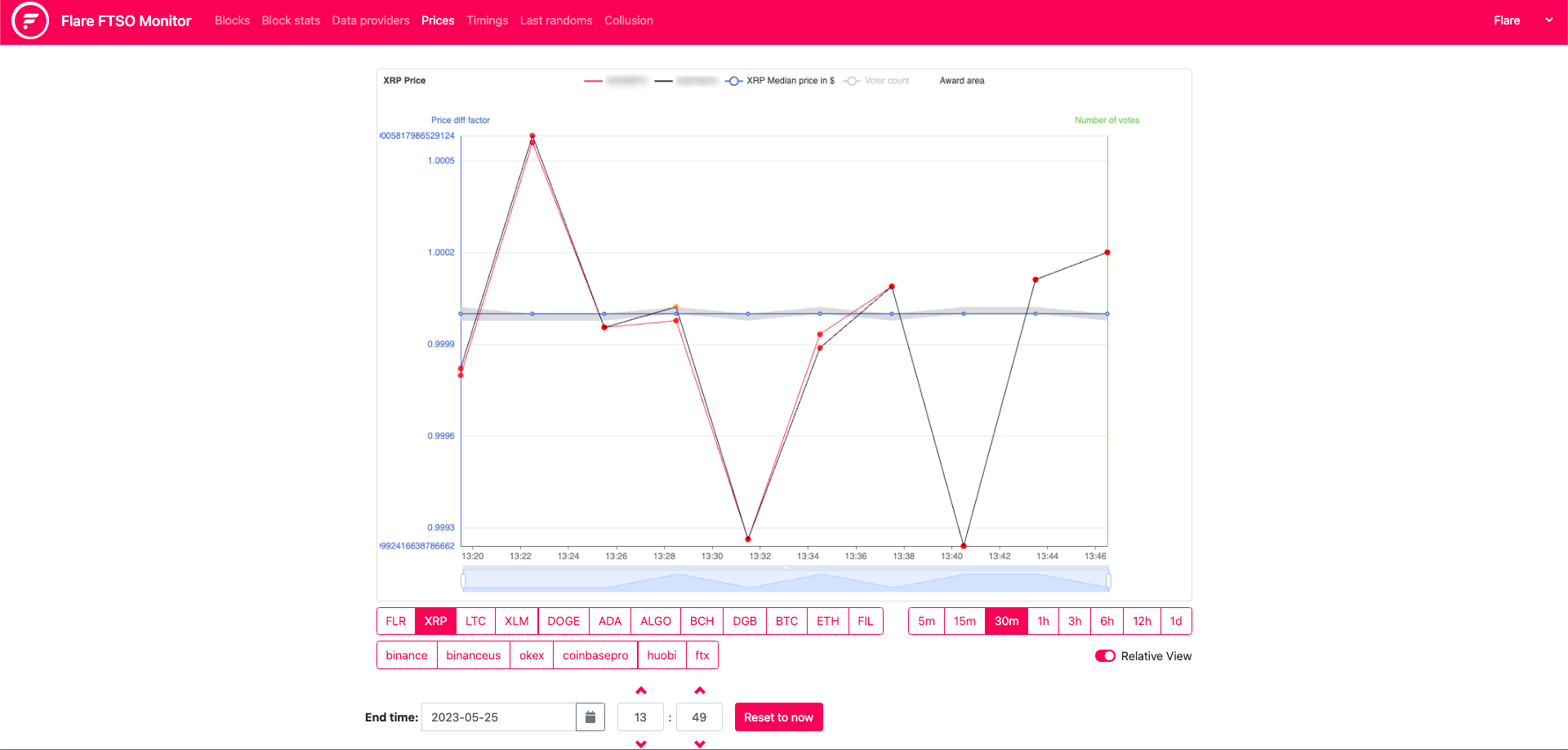
Comparing Price History#
In the price history, analyze the data for multiple providers consistently submitting prices that are distant from the median but near each other.
In your analysis, consider anomalous situations, such as an exchange going offline, a vast region of the internet becoming disconnected, or a stablecoin depegging from its reference asset. In these situations, submitted data from providers is expected to be wildly different. If multiple providers still manage to submit similar data, carefully examine them.
Although a depegged stablecoin should not affect FTSO prices, because price pairs use USD instead of a stablecoin, prices have been affected in the past, and the evidence is noticeable in the line graph. This situation reveals data providers who were using a stablecoin instead of USD in their submissions.
As shown in the image in each tab below, additional details about the data providers and the submitted data are provided beneath the price-history dashboard. The details on Songbird are different from the details on Flare because of the secondary reward band implemented by STP.02.
Use these details to more deeply explore the similarities between the data submitted by the providers you selected.
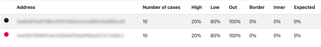
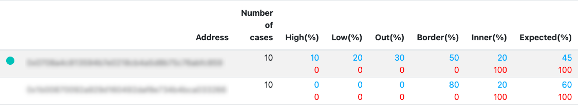
- Address: The hexadecimal identifier of the data provider. The circle beside the address corresponds with the address in the graph. The correspondence between the circle and the address works for up to five addresses.
- Number of cases: The quantity of data samples during the specified interval.
- High: The percentage of samples above the reward band.
- Low: The percentage of samples below the reward band.
- Out: The total percentage of high combined with low.
- Border: The percentage of samples on the border of the reward band.
- Inner: The percentage of samples inside the reward band.
- Expected: The success rate of the data.
The value is represented as a percentage and calculated by the formula
Inner + 0.5(Border).
In the following image, the percentage of samples are color-coded in the following ways:
- IQR reward band: Interquartile range percentages are blue.
- Pct reward band: Percentage range percentages are red.
- Address: The hexadecimal identifier of the data provider. The circle beside the address corresponds with the address in the graph. The correspondence between the circle and the address works for up to five addresses.
- Number of cases: The quantity of data samples during the specified interval.
- High: The percentage of samples above the reward bands.
- Low: The percentage of samples below the reward bands.
- Out: The total percentage of high combined with low.
- Border: The percentage of samples on the borders of the reward bands.
- Inner: The percentage of samples inside the reward bands.
- Expected: The success rate of the data.
The value is represented as a percentage and calculated by the formula
Inner + 0.5(Border).
The Similarity Metric#
This section describes the similarity metric used to obtain the cluster map. To estimate collusion, the similarity metric assigns a value of similarity between data submitted by pairs of data providers. As previously stated, collusion between data providers is evident when they submit similar data that is relatively distant from the median because similar algorithms will make similar mistakes.
For data providers DP1 and DP2 during a given range of price epoch for comparison, the prices P1 and P2 submitted for each cryptocurrency pair and epoch are checked.
If both prices are available alongside the median price M, the contribution to the collusion metric is calculated in the following way:
diff = abs(P2 - P1)
diff1 = abs(P1 - M)
diff2 = abs(P2 - M)

relativePriceDiff = max(diff / M, threshold)
relativeOffset = scale(min(diff1, diff2) / M)

contribution = relativeOffset / relativePriceDiff
where
threshold = 0.00000001
scale(x) = 20000 x + 1, if x < 0.0001 and 3 otherwise
The threshold is selected to avoid a division by zero when the two providers submit exactly the same data, and scale displays the data more clearly.